This is my first Power BI dashboard
Have you ever started learning something new, felt confident, then realized how little you knew?
That’s me with Power BI.
At first, I thought, “This one is easy – just drag and drop charts. Done!”
Then came anomalies, missing data, formulas, and complex relationships. I have fallen into the classic *Dunning-Kruger effect* – where beginners overestimate their abilities before hitting a reality check.
Hi there!
This is Aubrey. I will walk you through my journey of creating my first Power BI dashboard. Whether you’re just starting or refining your skills, I hope this helps you navigate the Power BI learning curve with confidence.
The Dunning-Kruger Effect and My Power BI Learning Curve
The Dunning-Kruger effect describes how (us) beginners often feel highly confident with limited knowledge we have, only to later realize how complex a subject actually is.
See how my learning curve looks like:
- The “I Got This” confidence
- I dragged in charts with ease, thinking it would be a simple task.
- True, it’s easy. Especially, If you have small and non-complex dataset.
- For those who already knew how to navigate the user interface, you’ll find it intuitive.
- I dragged in charts with ease, thinking it would be a simple task.
- The “Oh No, This is Hard” Moment
- Until data wasn’t structured correctly, relationships weren’t working, and my dashboard looked cluttered.
- I realized that a good dashboard isn’t just about “drag and drop” charts—it’s about telling a story.
- Until data wasn’t structured correctly, relationships weren’t working, and my dashboard looked cluttered.
- Climbing the Slope of “Does It Make Sense?”
- I learned about data cleaning, content clarity, labelling, and interactivity to make my dashboard more effective.
- The goal is to tell a compelling story through data
- Each mistake taught me something valuable – the “Aha” moment. Telling myself “now I know what to do next”
- I learned about data cleaning, content clarity, labelling, and interactivity to make my dashboard more effective.
- The “I’m glad, I Reached Out for Help”
- Designing a dashboard can be self-taught. Yes, but it takes time.
- You will never know which area need improvement if you are not asking for feedback
- Know that, other’s experiences can be a good reference too. So let’s not be afraid to seek help
- Designing a dashboard can be self-taught. Yes, but it takes time.
- Give me more data “I am now Confident for Real”
- The power in repetitions
- Repetitions may be mundane but it’s an effective way to let things be part of our muscle memory.
- I decided keep practicing. So when I encounter same error next time, I know what to do.
- The power in repetitions
(Caveat: Data are not created equal. There may be repetitions in analyses but every dataset means new insights and new challenge to figure out!)
How I built my First Power BI Dashboard
- Importing and Cleaning Data
Again, “garbage in, garbage out!” Power BI is powerful, but it cannot fix messy data on its own.
As a data analyst, you take control of what you feed into Power BI.
You can view the step-by-step data cleaning process here.
- Choosing the Right Visuals
Through Eskwelabs, I learned the 4 pillars of visualization. Knowing these 4 pillars guides me in choosing the right chart
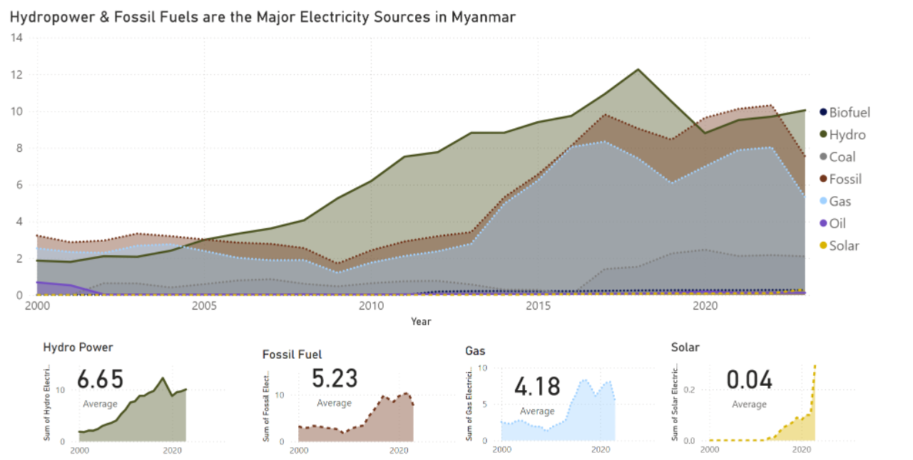
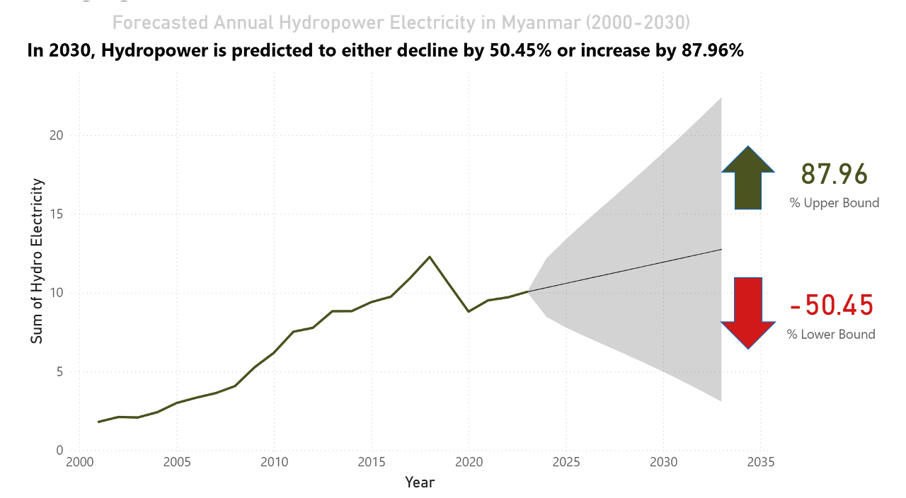
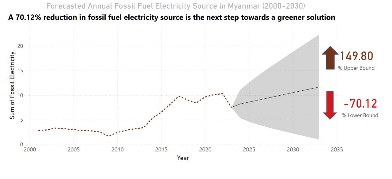
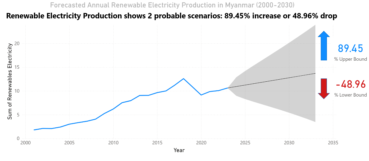
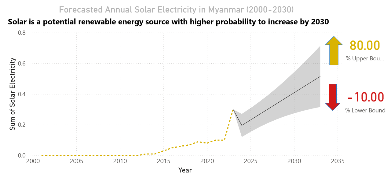
:white_check_mark: Composition: Stacked Area, Waterfall, Donut, Pictorial (e.g. electricity production mix of certain region)
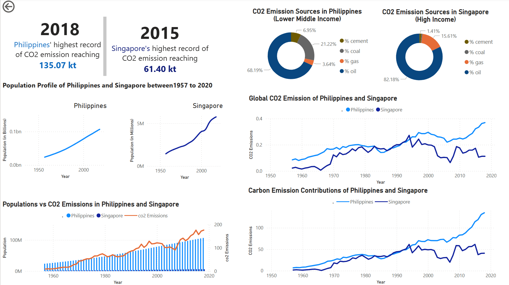
:white_check_mark: Distribution : Scatter, Histogram (e.g. CO2 emission across regions)
:white_check_mark: Relationship: Bubble and scatter (e.g. CO2 emission against population across year)
:white_check_mark: Comparison: Column, Lines, Stacked Area, Radial (e.g. CO2 emission between regions)
- Adding interactivity To avoid cluttered figures, I was advised to use slicers and filters. Also, consistency with colors and layout enhances story telling clarity
Take away
It’s easy to feel confident at first if you had fundamentals on how to use data visualization tools. However, real expertise comes with deeper learning – how you come up with solutions, how you interpret the data, and how effective and valid the visual is in telling a story.
A dashboard should be intuitive and meaningful, not just “ganda lang ang ambag”. Our audience mental load is our focus, not just the aesthetics visuals.
Finally, the best dashboards are built through trial, feedback, and refinement. This is my figures now, after playing around 3 datasets, asking and accepting suggestions from my mentor and groupmates.
“You don’t know what you don’t know until you gain more experience and expertise”